
Hey there, future web wizards! The Web’s Evolution; Ever wonder how we got from clunky, text-only websites to the slick, interactive experiences we have today?
The history of the web’s evolution is more than just a timeline; it’s a treasure trove of lessons for anyone building websites or apps today. Let’s dive in!
Introduction: From Humble Beginnings to Global Domination
Imagine a world without instant access to information, online shopping, or social media. Hard to believe, right? The web’s evolution has completely transformed how we live, work, and connect. But this incredible journey wasn’t a straight line. It was filled with challenges, breakthroughs, and a whole lot of learning.
Do you think all of that was easy? This article will unpack that history, but more importantly, we’ll focus on the practical lessons you can apply to your own web development journey. Ready? Let’s go!
Background: The World Before The Web’s Evolution (and the Problem to Solve)
Before the web’s evolution, sharing information globally was, well, a pain. If you’ve ever tried to collaborate on a project with someone far away without the internet, you know exactly what I mean.
You were stuck with snail mail, expensive phone calls, and the occasional fax machine. It was a frustrating and inefficient process. Let’s put some numbers on that frustration. In the late 1980s, international collaboration was hampered by significant communication costs and delays.
For example, a 10-minute phone call from the US to Europe could easily cost over $20 in 1989 dollars. Adjusting for inflation, that’s over $45 in today’s money!
Even sending documents was slow and expensive. A single-page fax could take several minutes to transmit, and the quality was often poor. International airmail could take a week or more to reach its destination. Imagine waiting days or weeks for crucial research data!
And consider the scale of the challenge for organizations like CERN. In 1989, CERN had over 3,000 staff members and visiting scientists.
These researchers came from over 40 countries. This highlights the sheer volume of international communication and collaboration that was taking place, even before the ease of the web.
Tim Berners-Lee, a British scientist at CERN, saw this problem firsthand. He wasn’t dreaming of cat videos or online games; he needed a way for researchers to share information quickly and easily.
His solution? A decentralized, open system where information could be linked and accessed by anyone, anywhere. A truly universal information space.
The number of computers connected to the nascent internet (then often referred to as ARPANET and NSFNET) was growing, but still relatively small compared to today.
In January 1989, there were an estimated 80,000 internet hosts. By October 1990, that number had grown to 313,000. This growth, while impressive for the time, underscored the potential for a much larger, more interconnected network – a potential Berners-Lee was about to unlock.
Lesson: Start with a problem. The best innovations, like the web’s evolution, address a genuine need. And remember, even with limited resources, a powerful idea and collaboration can change everything.
Methodology: Reconstructing the Early Web – A Digital Archaeology Project
Reconstructing the history of the early web is a bit like digital archaeology. Unlike many modern technologies, the early days of the web’s evolution weren’t meticulously tracked and archived online. This presents some unique challenges:
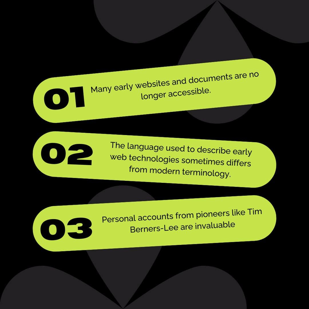
- Limited Digital Records: Many early websites and documents are no longer accessible. The Internet Archive’s Wayback Machine is a valuable resource, but it doesn’t capture everything.
- Evolving Terminology: The language used to describe early web technologies sometimes differs from modern terminology, requiring careful interpretation.
- Reliance on Recollections: Personal accounts from pioneers like Tim Berners-Lee are invaluable, but memories can be incomplete or subjective.
To overcome these challenges, this article relies on a combination of:

- Contemporary Accounts: We’ve prioritized sources that were published at the time of the events being described (e.g., early articles about Mosaic, Netscape, etc.).
- Institutional Archives: Organizations like CERN and the ISC (Internet Systems Consortium) maintain historical records that provide crucial data and context.
- Cross-Referencing: We’ve compared information from multiple sources to identify consistent patterns and address discrepancies.
Lesson: Even seemingly “digital” history can be surprisingly difficult to reconstruct. Be aware of the limitations of available information and the importance of rigorous sourcing.
The history of the web’s evolution teaches us that technology constantly reshapes how we live and work. Want to understand the next wave of changes? Read my post, “Emerging Tech Shaping the Future of Work and Life,” for a glimpse into the technologies that will transform our world.
Results: Building the Foundation (One Hyperlink at a Time)
In 1990, Berners-Lee’s vision took concrete form. He created the building blocks of the web:
- HTML: The language for structuring web pages.
- HTTP: The protocol for browsers and servers to communicate.
- URL: The system of addresses for finding things online.
He also built the first web server and the first web browser, “WorldWideWeb” (later renamed Nexus). Can you imagine using that first website at info.cern.ch ? Pure text. No images. No videos. Just hyperlinks connecting pieces of information. It was basic, but it was groundbreaking.
The first web server outside Europe landed at SLAC in California in December 1991. This was a major step in the web’s evolution , giving researchers access to the SPIRES database. According to CERN, this expansion was a crucial step in making the web a global resource.
But the early web was still pretty technical. Accessing it required special software. That’s where things got interesting… the browser wars!
Mosaic, released in 1993, was a game-changer. It was the first graphical web browser that became widely popular. Suddenly, the web’s evolution was accessible to ordinary people, not just techies. This is the browser that made the web user-friendly.
Then came Netscape Navigator in 1994, co-founded by Marc Andreessen. It was the first commercial browser, and it took the web by storm.
This sparked fierce competition with Microsoft’s Internet Explorer, a battle that, for better or worse, pushed the development of web standards (and sometimes, ignored them altogether!).
Lessons: Make it user-friendly! Mosaic’s success proved that accessibility is key to adoption. Competition can be a powerful driver of innovation, even if it gets messy. And, open standards are crucial for a healthy web ecosystem.
Discussion: Growing Pains, Mobile Mania, and the Modern Web
The late 1990s and early 2000s ushered in the era of “Web 2.0.” This wasn’t a new version of the underlying technology, but a shift in how we used the web. Websites became dynamic and interactive, fueled by the rise of user-generated content.
Think blogs, wikis, social media platforms – a fundamental change from the static, “read-only” web of the early days.
The web’s evolution has created incredible opportunities, but it’s also introduced new risks. Protect your business from online threats. Read my post, “Cyber Threats – Do You Love your business? Protect it!” for essential security strategies.
Technologies like JavaScript, CSS, and AJAX played a crucial role. They allowed developers to create websites that felt more like desktop applications, offering a much richer and more responsive user experience. This was a significant step forward in making the web more engaging and interactive.
Then, in 2007, the iPhone arrived and everything changed.
Suddenly, millions of people had a powerful, pocket-sized computer with internet access. But most websites were designed for large desktop screens. This created a major problem, and it sparked a revolution in web design.
This revolution was responsive web design, championed by Ethan Marcotte. The core idea was simple: websites should adapt to any screen size – desktops, tablets, and, crucially, smartphones.
It wasn’t just about shrinking things down; it was about rethinking the entire structure of web content for a multi-device world. This involved using:
- Fluid grids
- Flexible images
- Media queries
Today, mobile-first design is the dominant approach. Developers often begin by designing for the smallest screen and then progressively enhance the experience for larger devices.
Why? Because for many people, their phone is their primary (and sometimes only) way of accessing the internet. According to Statista, mobile devices (excluding tablets) generated 54.4% of global website traffic in the fourth quarter of 2023.
And it wasn’t just about screen size. Performance became paramount. As websites became more complex, users expected lightning-fast loading times.
Slow websites? Forget it. People will bounce. This led to a huge emphasis on optimization techniques, including image compression, code minification, and caching – all the things that make websites snappy and responsive.
Finally, we must consider accessibility. The web should be usable by everyone, regardless of ability. Web accessibility guidelines (WCAG) provide a framework for creating websites that are perceivable, operable, understandable, and robust for people with disabilities. It’s not only the right thing to do; it’s often a legal requirement.
Lessons: Adapt or die. The web is in constant flux. You must embrace new technologies and user behaviors. User experience (UX) reigns supreme. A website needs to be beautiful, usable, fast, and accessible. The mobile revolution was a wake-up call, emphasizing the need to design for a multi-device world, and building an inclusive web is a shared responsibility.
Conclusion: Your Turn to Build the Future
The history of the web is a wild ride, full of unexpected twists and turns. But it’s also a story of incredible ingenuity and collaboration. From text-only pages to immersive online experiences, we’ve come a long way.
Curious about what the next big shifts will be? I explore the most impactful trends in my post, “Top 5 Emerging Tech Trends Businesses Must Watch in 2025.” Don’t miss it!
Here’s the takeaway:
- Solve real problems: Like Berners-Lee, focus on addressing genuine needs.
- Embrace open standards: They’re the foundation of a healthy web.
- Prioritize user experience: Make it beautiful, usable, fast, and accessible.
- Never stop learning: The web is always evolving. Stay curious!
- Build ethically: The web has a huge impact. Use your powers for good.

The future of web development is being written right now. AI is already changing how we build websites. Web3 and the metaverse are on the horizon. It’s an exciting time to be a web developer!
So, what are you waiting for? Go out there and build something amazing!
The web is built on technology, but it’s used by people. Are your employees your greatest cybersecurity asset or your biggest vulnerability? Find out in my post, “The Human Factor In Cybersecurity: Greatest Ally Or Hidden Risk?“
FAQs: Quick Answers to Common Web History Questions
- Q: What’s the difference between the Internet and the World Wide Web?
- A: Think of the internet as the roads, and the web as one of the things you can do on those roads (like driving a car). The internet is the network; the web is a system for accessing information on that network.
- Q: Why was Mosaic so important?
- A: It was the first widely popular graphical browser, making the web accessible to non-technical users. It’s what made the web user-friendly.
- Q: What is Web 2.0?
- A: It’s the shift to dynamic, interactive websites where users create and share content (think blogs, social media). It’s the “read-write web.”
- Q: What is responsive web design?
- A: It’s designing websites that adapt to any screen size, providing a great user experience on all devices.
- Q: Why is web accessibility important?
- A: The web should be usable by everyone, including people with disabilities. It’s about inclusivity and, often, a legal requirement.
- Q: How can I start to learn web development? A: There are a multitude of free resources online! Websites like Khan Academy, freeCodeCamp, and Codecademy.
- Q: How did the first website look? A: The first website was a simple page that contained information about the World Wide Web project, it only included text and hyperlinks to navigate. You can see it here: info.cern.ch


Your point of view caught my eye and was very interesting. Thanks!
Thank you for your sharing. I am worried that I lack creative ideas. It is your article that makes me full of hope. Thank you.
This post is a testament to the power of well-crafted words. You managed to convey a significant amount of meaning and emotion through your writing.
You have a gift for connecting with your readers through your writing. I felt a real sense of connection to the ideas you presented in this post.
I found myself taking notes while reading this post, which is always a good sign! There were so many valuable takeaways and points that I want to remember and reflect on further.
I always learn something new or see something in a different light when I read your blog. This post was no exception. Thank you for expanding my understanding of [mention a general area like ‘this subject’].
It’s refreshing to read a blog post that feels so authentic and genuine. Your voice comes through clearly, and it makes the content all the more relatable and impactful. Excellent work!
You’ve definitely given me some new things to consider. Thanks for sparking that.
Fantastic content as always! You consistently deliver quality.
Couldn’t agree more with the points you’ve made here. Spot on!